FaceoffFembot's damage tutorial for Paint.net

In this tutorial, we're going to learn step-by step how to do a damage effect, using the picture on the right as a base. The model is Sarah Marie Summers. An archive containing all the pictures used is available at the bottom of the page.
This tutorial assumes you have a basic familiarity with Paint.NET, such as knowing how to use tools, layers, resizing, rotating, etc.
While it is intended for use with Paint.NET, other image editing software like Photoshop or Gimp may have tools similar enough to make this tutorial useful.
What you'll need
- Paint.NET
- Alpha Mask Import Plugin (2.0)
- BoltBait's Plugin Pack
- Bevel Object
- Fill From Clipboard
- pyrochild plugins
- Outline Object
- Trail
- Source pictures
- Photo manipulation workshop
- FaceoffFembot's manipulation archives
- textures.com
- Your personal library
| Tip 1: textures.com requires you to create an account that only give you 15 download points per day. Come back even when you're not working on a manipulation to increase your stock. |
| Tip 2: After getting pictures for a manipulation, keep them in a personal library. |
Preparing the workspace
Create a folder for your project, and copy every file you'll use in it. At the end, feed the files through FileOptimizer, and use Winrar or IZArc to compress and archive your project.
Optimizing the original picture
The original picture provided is of pretty poor quality. Feed it to Google's Search by image or the reverse image search of your choice. Select the largest, cleanest version returned (no compression artifact, no nearest-neighbor upscaling, etc.) and feed it again. Do this a couple times. This will allow you to:
- Work with the best foundations possible
- Source the model
We now have a cleaner, larger version of our picture, but it is still too small. I prefer working more in the 2000x3000 range, which we're currently at half. We could use Paint.NET's Image > Resize, but this will make any compression remaining in our picture pop. Feet it to waifu2x instead, saving the lowest comfortable noise reduction setting result. This will double the size of the picture while keeping it somewhat clean.
| Tip 3: Bookmark any website you may have a recurring need for. |
Preparing the alpha mask sources
Download a couple masked exposed plaster pictures off textures.com. Save them in your project folder. Look for a variety of shapes: circular, jagged, smooth, cracks...
Let's turn these pictures into something that can be used for alpha masking. Open them with Paint.NET. Use Effects > Hue / Saturation, lightness set to -100, to turn them uniformly black. Since we won't have any use for the originals, you can save over them (Ctrl + S).
Making the alpha mask
We now have the best original picture we can, and several .png files of cracked and damaged shapes. Time to create the alpha mask.
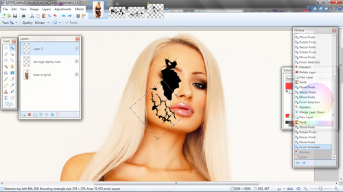
Open the original picture in Paint.net. Create a new layer, and rename the two to "base-original" and "damage-alpha_mask" respectivelly. On this new, empty layer, we're going to paste various shapes of our liking from our alpha mask sources.
Each time you add a new element, create a new layer before pasting, and merge the layers once you're satisfied with the placement. Think about the kind of damage the fembot received and the direction it came from.
| Tip 4: Duplicate a layer containing a transparent element to thicken the more transparent parts. |
You might want to change the dimension and rotation of your elements. Ideally, using Image > Resize and Layers > Rotate / Zoom in conjunction with Crop to selection will give you a better quality over the Move Selected Pixels tools. However, this will increase your workload significantly and will barely be visible in the end. Prefer it only when working with very small size.
Once you feel done with your shapes, you might notice it has a much sharper quality than the original picture, and elements vary in quality. Use Effects > Blurs > Gaussian Blur on a low setting to tie it together.
Damaging
Alpha masking, at last
We now have our damage alpha mask. Time to apply it.
Go to the original picture's layer and duplicate it. Rename the new layer "base-base" and hide the old one. Go to "damage-alpha_mask", select it in its entirety (Ctrl + A) and copy it (Ctrl + C).
| Tip 5: Always duplicate a layer you're going to alter but might need to come back to. |
Hide the damage alpha mask layer. Select your base layer and use Effects > Alpha Mask. Every pixel under a black pixel will be made inversely more or less transparent depending on the alpha value of its corresponding pixel on he alpha mask layer.
| Tip 5: Always check Mix Alpha when using Effects > Alpha Mask. |
Adding depth
Let's give some depth to this hole. Duplicate your base layer, then use Effects > Object > Bevel Object. Set the strength to maximum and check off "Keep original image".
Beveling will produce unnecessary beveling on the picture's border. Use the Rectangle Select tool to delete them.
Rename your layer "damage-bevel", set its blending mode to Overlay and reduce its opacity.
Go to your base layer and duplicate it. Rename it "damage-depth_base", and use Effects > Blurs > Surface Blur on its default settings. Then, use Adjustments > Brightness / Contrast with "Brightness" between -25 and -50.
Move the depth layer at the bottom, and use Effects > Object > Trail. Check off "Fade out" and reduce "Length" to between 5 and 10. Adjust the angle relative to that of the camera and the surface.
Adding texture
Now let's add texture to this damage. This section will start relying on techniques introduced above.
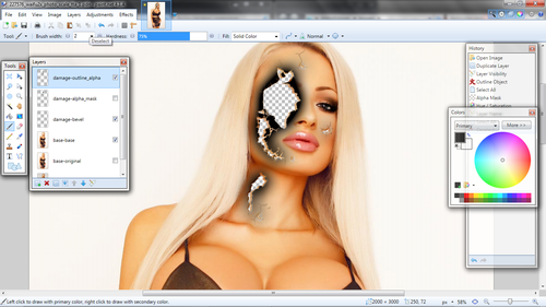
Duplicate and rename "damage-alpha_mask" to "damage-outline_alpha", and use Effects > Object > Outline. Set the color to pure white for good contrast, and find "Width" and "Softness" values you think are good. A higher "Softness" setting results in a more natural fade, but will make the effect less visible.
Now, we will turn the result into another alpha mask. Copy-paste the entirety of the original damage alpha mask layer, and use it to remove the central parts of what we'll call the damage outline alpha mask. Use Effects > Hue / Saturation to it uniformly black.
Now we'll need additional source pictures from textures.com, which I've already selected:
- https://www.textures.com/download/plastic0024/9840
- https://www.textures.com/download/plasterwhiteworn0215/90047
- https://www.textures.com/download/plastic0114/55111
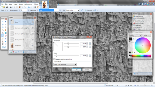
These are seamless pictures, which mean they can be repeated without looking too artificial like tiles. Since we're going to use them with the "Overlay" layer blending mode, they need to be neither too bright nor too dark, but somewhere in the middle. First, use Adjustments > Black and White, then Adjustments > Levels. Adjust the right-hand graph so the "cone" is center and does not spread too far either way.
With that done, select and copy the entire picture, and use Effects > Fill > From Clipboard to cover an entire new layer. Do this procedure with the first two linked textures. Use Effects > Blurs > Gaussian Blur as before to not have a difference in sharpness.
| Tip 6: Resize the two textures with different scales to avoid repetition. |
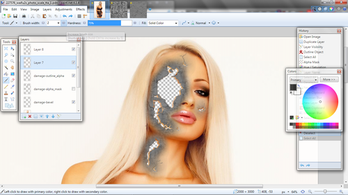
Copy the whole "damage-outline_alpha" layer and apply it on both textures like the original "damage-alpha_mask".
Set both layers blending mode to "Overlay" and adjust transparency.
| Tip 7: If the result does not "pop" enough, use "Contrast" in Adjustments > Brightness / Contrast to fix it. |
Let's also give damage_depth-base" some texture. Repeat the process with the third linked texture, using "damage_depth-base" as an alpha mask.
| Tip 8: Save treated images for future projects. |
| Tip 9: You can use normal, non-seamless textures, although they need to be large enough. You can also use the Seamless Texture Helper Plugin to make your own seamless textures. |
Robotizing
We're close to the end of this manipulation. All that is left now is adding he robotic elements, and tie them together with the rest of the image. We're going to use three pictures from FembotWiki:
The First picture will serve for the basis of the robotic skull, the second for the eye, and the third for the gash on the neck.
Building the robot
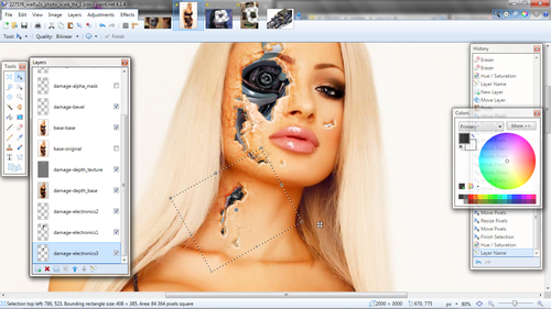
Like building the first alpha mask, this is only a matter of copy-pasting the parts that you like onto new layers, rotating and resizing them as you see fit.
You can also isolate a part of a picture using the Eraser tool before copy-pasting. Set the Hardness to minimum to have a smooth delineation.
To bring the elements together, use Adjustments > Hue / Saturation. Here, we reduce how vivid the element is ("Saturation") and switch it from blue to green ("Hue").
Do the same for the neck using the third picture from the Wiki.
Tying it together
Use the Color Picker tool to sample the color of the model's skin. Create a new layer between the robotic parts and "damage-depth_base", and name it "damage-electronics_tint". We're going to set the layer to "Overlay" later, so as said before we need something neither dark nor light. Since we're filling the whole layer with a single tint, we can use the color window for that. Expand it, and set the V value of the HSV (hue, saturation, value) section to 50. Use the Paint Bucket tool to fill the layer.
With that done, set the layer blending mode to "Overlay" and adjust opacity. This brings together the model's skin and the robotic parts.
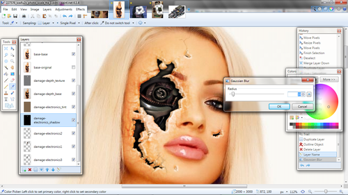
Now we're going to increase the effect of depth by creating a shadow over the robotic parts. Duplicate "damage-depth_base" and move it under "damage-electronics_tint". Use Adjustments > Hue / Saturation to make it black. Use Effects > Object > Trail with the same settings as earlier, then Effects > Object > Outline with the default softness and same "Width" / "Distance".
Finally, use "Effects > Blur > Gaussian Blur" to smoothen it.
Finishing touches
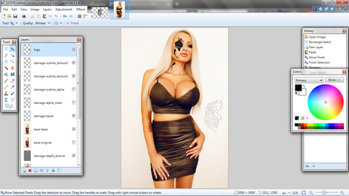
The manipulation is basically finished, as far as damage goes. All that is left now is up to you, whether it's adding text, special effects such as smoke or sparks, or your logo. I will go with the latter.
And here we are with the finished product!
I hope you have enjoyed this tutorial and that it will be of use. Download the archived manipulation folder here.

